Showing probabilities and risk in diagrams
Risk management and knowing the probabilities of a success are important in any business, but much more so when human lives are on the line. You can indicate risks in diagrams with different shapes, styles and colours, or by showing percentages, even if you are not using a probability tree to visualise your system or task.
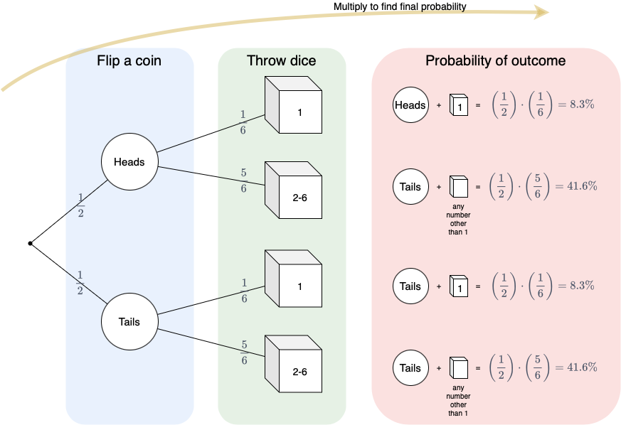
Probability trees
Extensively used in maths, probability tree diagrams show all possible outcomes of an event and help you solve probability questions.
- For each choice or option, put the probability on the connector to the next choice.
- To find the final probability of any path, multiply the probability on each branch, and turn it into a percentage.
In the example probability tree above, the first task is a coin toss, with 50% chance on either outcome. The second task is to throw a dice, looking for a number one. Any other number will not be sufficient, so they are combined on one branch.
There is only a 8.3% chance of getting the combined result heads + 1.
Open the example probability tree in draw.io
Probability flows
Probability trees are limiting - they become unreadable when dealing with a highly complex processes with many different outcomes.
You can indicate probabilities in readable ways on many different types of diagrams - not just trees.
During the Brexit turmoil, you may have seen Jon Worth’s popular “Where now” flowcharts with probabilities attached to each path. This is an excellent way to find out which outcome is most likely.
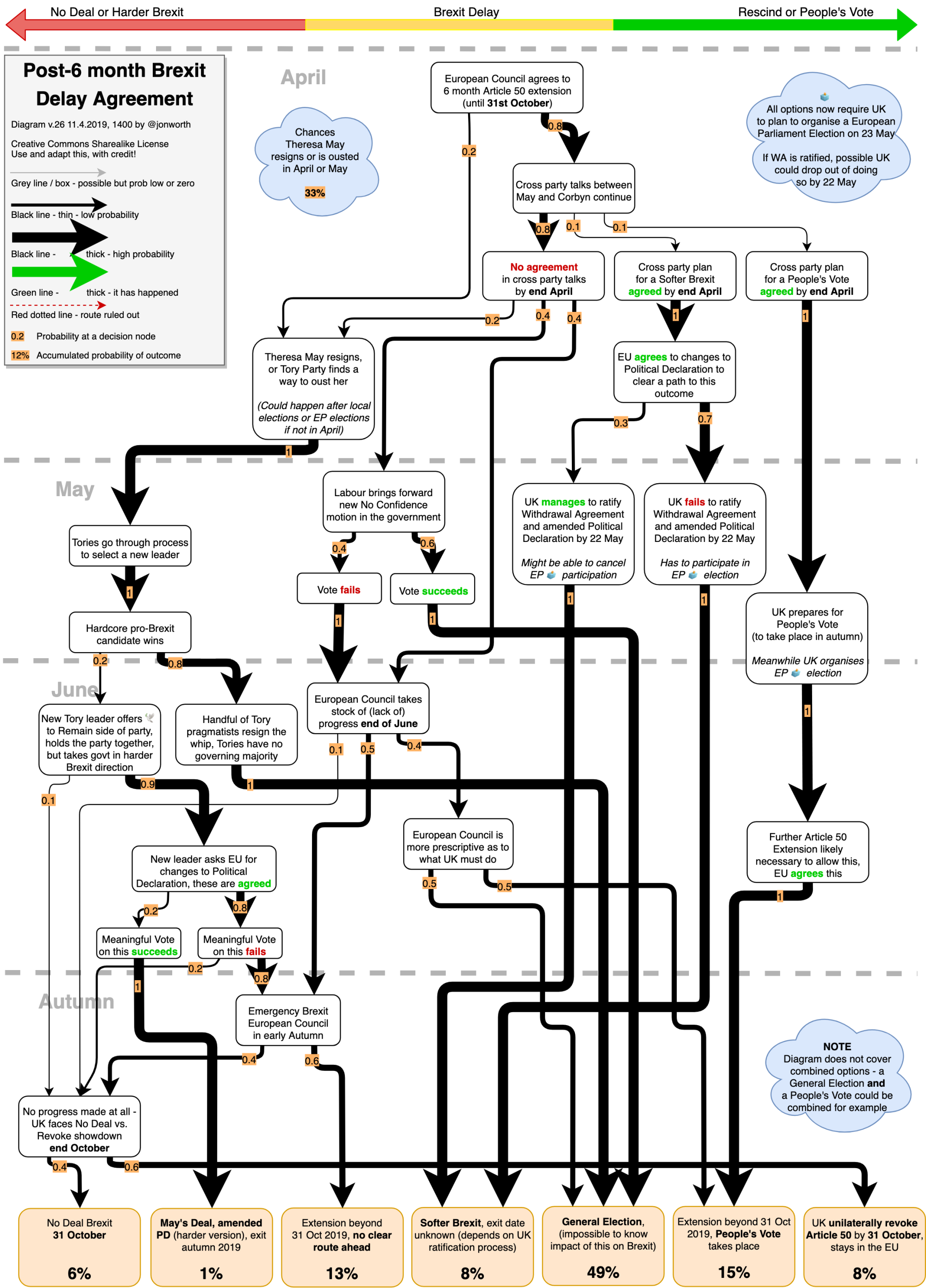
However, political processes like this are still quite simple when compared to many engineering and production challenges.
Risk overview of a complex project
In complex engineering projects, there are so many nested manufacturing processes with probabilities attached to each branch in each sub-process that a simpler overview diagram is needed to serve as a guiding roadmap and status report.
Note that the more detailed probability flows are still required to manage those safety critical risks - these diagrams would be drawn by the teams managing those subprocesses. Each team would then share their probabilities and risks, and this will be shown with styles and notes on a risk overview diagram.
The following example explores the status and current likelihood of success for each step toward establishing a lunar habitat. There are many complex manufacturing steps involved for each facet needed to support human life.
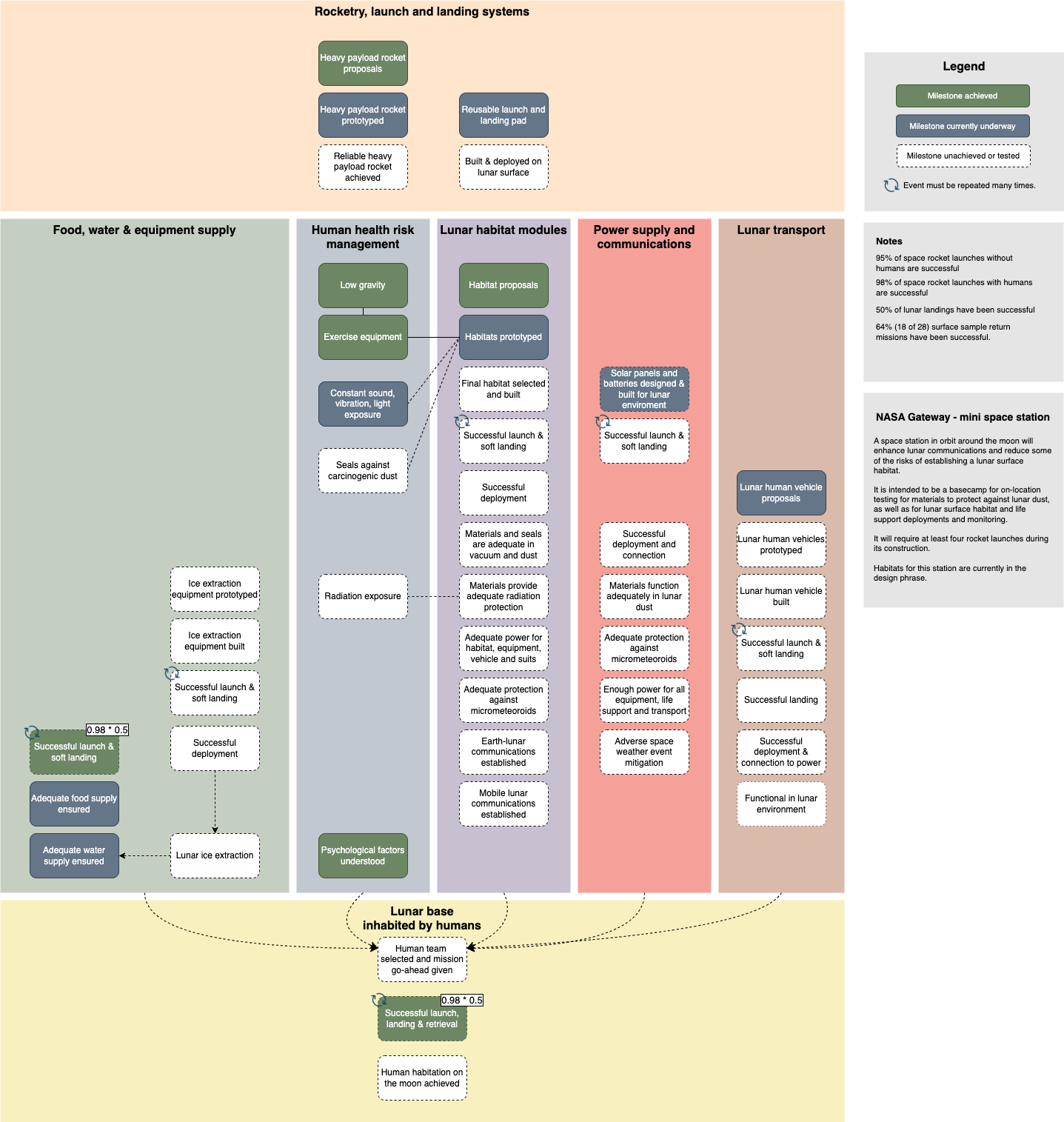
Open this diagram in the draw.io viewer
Hover over the steps and notes in the diagram viewer to see the related reference material from NASA, science research papers and news organisations used as a basis for this diagram.
Achieved: Some milestones have been reliably achieved (in green) - smaller rockets reliably ferry supplies and humans to and from the International Space Station (ISS).
In progress: Some components are being prototyped (in blue) - a couple of habitats are installed on the ISS, and the heavy-payload rockets are being tested, albeit often unsuccessfully. Food and water is being successfully supplied to the ISS, thus these necessary steps are drawn as in-progress.
Unknown: Most milestones are only at the concept stage, never even prototyped (white with dashed outlines). The probability of these complex steps in the project are still unknown, and therefore cannot be indicated.
This diagram cannot show the probability of success, due to the sheer number of required steps that haven’t been achieved. By looking at each individual step, you can roughly guess that the timeframe needed will be long, and that the current predictions are overly optimistic.
Of course, there are even more unknowns - technologies and materials - that will be needed to reach Mars.
Related
To use fractions or formulae in labels, make sure nothing is selected, then enable the Mathematical Typesetting checkbox in the Diagram tab of the format panel if you are using the Simple editor mode, or enable Extras > Mathematical Typesetting in classic mode.
There are several different types of diagrams for modelling threats and risks in software - data flow diagrams, process flow diagrams and attack trees are used extensively in software and IT system threat modelling.