Set custom colours in Confluence Cloud
You can customise the various colour palettes in draw.io for Confluence Cloud. This is useful when multiple diagram authors need to create visual assets and document workflows to match a specific corporate image or departmental style.
Note: Dark mode, by default, will automatically adapt your custom light mode colours to be clearly readable when the diagram is viewed or edited in dark mode. You can also specify custom dark mode colours as detailed below.
Learn more about diagramming in dark mode and adaptive colours.
Set custom colours in the Confluence Cloud settings
Administrators can set global default and custom colours and styles in the draw.io configuration.
- Go to the draw.io Configuration section in the Confluence Cloud settings.
- On the draw.io Configuration tab, enter the JSON string with the new colour information for the various palettes (sample code and examples are below). See all of the options that you can customise in the JSON string
- Click Save to save the new colours. Diagram authors will now see either the new default or new custom colours in the palettes you have configured when they next load a draw.io diagram in the editor.

Important: To change even one colour in any of the default colour palettes, you must specify all of the other colours in that palette.
There are three different palettes where you can set new default or custom colours.
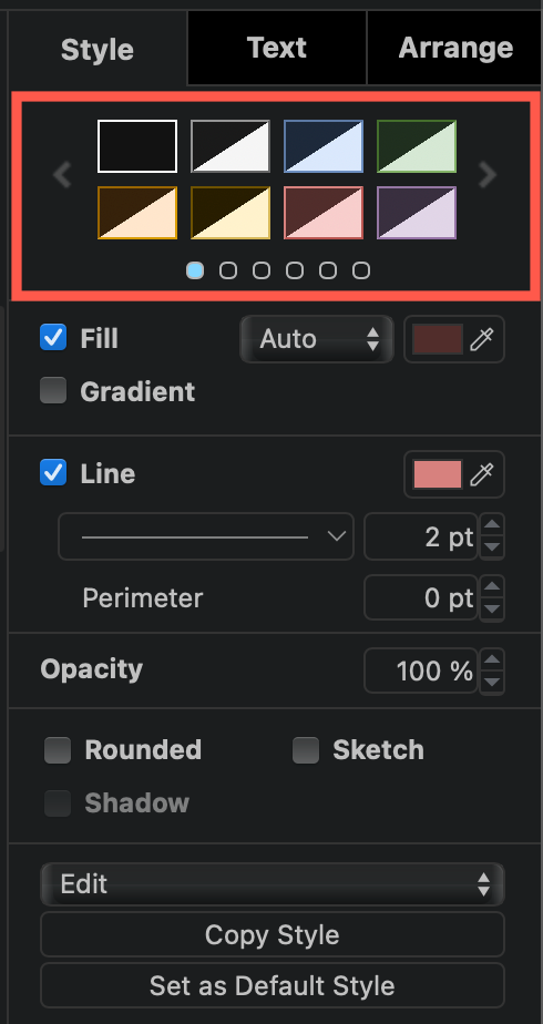
Default colour schemes - format panel
These change the style palette displayed at the top of the format panel on the Style tab. Each style palette page of colours is separated by a square bracket. Each style on the palette consists of a fill colour, a stroke colour, and an optional gradient colour, if desired.
When a user-defined dark mode colour has been set, or when you are in dark mode, both the dark and light-mode colours are shown in the colour tile as a light and a dark triangle.

For example, these are the default colours and styles used by the first two pages of styles in the style palette, as part of a JSON string. Each page of the palette is enclosed in square brackets. In this palette, you must use the leading # when you specify the hex colour code.
{
"defaultColorSchemes": [
  [null, {"fill": "#f5f5f5", "stroke": "#666666"},
    {"fill": "#dae8fc", "stroke": "#6c8ebf"},
    {"fill": "#d5e8d4", "stroke": "#82b366"},
    {"fill": "#ffe6cc", "stroke": "#d79b00"},
    {"fill": "#fff2cc", "stroke": "#d6b656"},
    {"fill": "#f8cecc", "stroke": "#b85450"},
    {"fill": "#e1d5e7", "stroke": "#9673a6"}],
  [null, {"fill": "#f5f5f5", "stroke": "#666666", "gradient": "#b3b3b3"},
    {"fill": "#dae8fc", "stroke": "#6c8ebf", "gradient": "#7ea6e0"},
    {"fill": "#d5e8d4", "stroke": "#82b366", "gradient": "#97d077"},
    {"fill": "#ffcd28", "stroke": "#d79b00", "gradient": "#ffa500"},
    {"fill": "#fff2cc", "stroke": "#d6b656", "gradient": "#ffd966"},
    {"fill": "#f8cecc", "stroke": "#b85450", "gradient": "#ea6b66"},
    {"fill": "#e6d0de", "stroke": "#996185", "gradient": "#d5739d"}]
]}
To set a custom dark mode color scheme, use the light-dark() color function and add the colour codes for each component of the scheme.
{"fill": "light-dark(#f5f5f5,#1A1A1A)",
 "stroke": "light-dark(#666666,#959595)"}
Custom colour schemes - format panel
Instead of modifying these default colour schemes in the style palette, you can define additional custom colour schemes. Custom colour schemes are added before the default colour schemes in the format panel palette.
For example, add the following to the JSON string to add a page for five custom pastel colours and no borders in the style palette, plus one final gradient and font with custom adapted colours as the final scheme. Note that as there are only six schemes defined, two schemes are blank.
Click on the right or left arrows on either side of the style palette to step to the other style palette colours.
{
  "customColorSchemes": [
    [{"fill": "#ffb3ba", "stroke": "none"},
    {"fill": "#ffffba", "stroke": "none"},
    {"fill": "#baffc9", "stroke": "none"},
    {"fill": "#bae1ff", "stroke": "none"},
    {"fill": "#eecbff", "stroke": "none"},
    {"fill": "light-dark(#ffdfba,#513616)",
     "stroke": "#888888", "gradient":
     "light-dark(#513616,#ffdfba)",
     "font": "light-dark(#444444,#AAAAAA)"}]
]}

Preset colours in the colour dialog
Preset colours appear in the top two lines of the colour dialog, and are ideal for modifying to display your corporate or desired colours. Open the colour dialog by clicking on one of the colour buttons in the Style and Font tabs of the format panel: Fill, Line, Gradient, Font Color or Background Color.
-
To change the default preset colours, you need to specify all 24 colours in the
presetColorsoption, without the#before the hex colour code if you want to define them for light-mode and adapt automatically. -
If you want to specify light and dark colours, use the
light-dark()function and write its colours codes with a#.
For example, to use an orange preset colour palette with a red/green light-dark() colour as the final colour on the palette, add the following to the JSON string in the draw.io Configuration settings in Confluence.
{
  "presetColors":
     ["f79862", "f05e23", "be5504", "d7722c", "cb5c0d", "b3672c",
      "b1560f", "813f0b", "ef820d", "ffbf00", "cc7722", "fda50f",
      "ef7215", "964000", "ff7417", "793802", "eb9605", "883000",
      "fd6a02", "f9a602", "8b4000", "f9821a", "fc6600",
      "light-dark(#ff0000,#00ff00)"]
}

If you don’t want to change the default preset colours, you can add custom colours to the front of the preset colour palette. For example, three shades of orange as custom preset colours are added to the front of the default palette.
{ "customPresetColors": ["f79862", "f05e23", "be5504"] }

Default colours in the main colour palette
The large colour palette under the preset colours can also be customised. You can only change the default colours here, and you have to enter all 120 colour codes.
- without the leading
#to define light colours only. - with
light-dark()function and with the leading#for custom dark mode colours in the main colour palette.
For example, a very warm palette full of reds, oranges and creams, that will automatically adapt to dark mode:
{
  "defaultColors":
     ["7c0a02", "660000", "c41e3a", "960018", "e23d28", "58111a", "e44d2e",
     "ed1c24", "f88379", "b31b1b", "ee204d", "dc143c", "8b0000", "b22222",
     "ce2029", "ed2939", "cd5c5c", "a50021", "800000", "f2003c", "c40233",
     "841617", "ffc0cb", "a45a52", "ff0000", "e0115f", "da2c43", "fa8072",
     "ff91a4", "ff2400", "e60026", "a91101", "e34234", "ff0500", "c46210",
     "fbceb1", "ff9966", "fe6f5e", "bf4f51", "964b00", "bf5700", "e09540",
     "ed9121", "ff7538", "ff8c00", "fe5a1d", "ff4f00", "fed8b1", "fdbcb4",
     "ff7f00", "ff9f00", "ff5800", "ffefd5", "ffe5b4", "d99058", "ec5800",
     "ee7f2d", "ff7518", "ff7900", "d44500", "f28500", "f88379", "ff6347",
     "ff8200", "ffaa15", "ffff99", "fce883", "ffffcc", "ffd300", "ffd700",
     "daa520", "e8ac41", "c3b091", "fdff00", "fffacd", "ffffe0", "fafa37",
     "f8de7e", "efcc00", "fedf00", "ffef00", "ffff00", "fada5e", "eed202",
     "ffff66", "f3e5ab", "eedc82", "fffdd0", "edeae0", "faebd7", "ffab00",
     "ff991f", "ff8b00", "df7a00", "bf6800", "9f5700", "ffebe6", "fefefa",
     "f5f5dc", "e3dac9", "f7e7ce", "fff8dc", "efdfbb", "f0ead6", "fffaf0",
     "f8f8ff", "fffff0", "ffdead", "fdf5e6", "f1e9d2", "fff5ee", "fffafa",
     "f5f5f5", "ffffff", "f0f8ff", "f0ffff", "fff0f5", "f5fffa", "ffe4e1",
     "none"]
}
